Mid-Century Modern Kitchen Remodel in Miami – WOW!

Does this kitchen look familiar? Right? We have all had or had relatives in the 80s that had this dark kitchen. This kitchen is completely enclosed except for the 2 small openings into it. It’s a hard concept to understand with all the open kitchens we see now. This style is coming back I hear, but I for one am not ready for it. With only the light coming from a small window and the glass on the side door, this kitchen was dark. The only light was the ceiling chandelier. This home was built in the 60s in Miami and has been maintained beautifully. This kitchen was renovated in the 80s with the style at the time. Tuscan and dark. It is a small galley kitchen
So our client, who also happens to be a great lifelong friend, asked us to remodel this kitchen into a new modern one but keeping with the home’s mid-century style that she likes. We said ‘YES PLEASE!” She didn’t want to make it an open concept kitchen which is fine but we knew we had a few things we had to do. (1) bring in more light everywhere and (2) create more storage for her and (3) create a modern mid-century beauty.
Let’s look at a few before and after pictures to get a better feel for the transformation.


Wow! Now wouldn’t you rather cook on the beautiful new built-in cooktop and oven? Yes! We eliminated the large cabinet to the right of the stove and added more counter space, there was none there before when cooking. Crazy! We added lighting under the cabinets as well as overhead in recessed lighting. Plenty of light there now!


This is another WOW! This corner in the kitchen was waster and underutilized. The homeowner needed more storage so she placed a piece of furniture there to help. Didn’t work well at all. Now we created a corner unit with once again plenty of counter space. You could use this whole space as a buffet area if you wanted to. The corner unit houses 2 large lazy susans for even more utilization of every inch of space. We added 2 shelves for the homeowner to display collectibles, cookbooks, etc creating a beautiful space in this corner and still keeping it light.


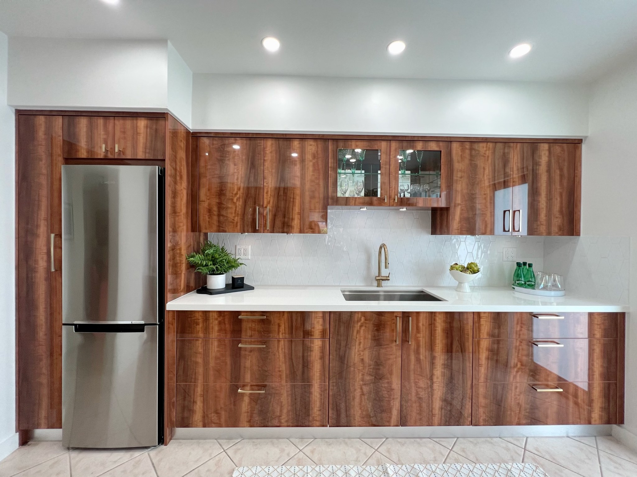
Look at the beautiful brushed brass handles we purchased. These gorgeous beauties are so mid-century. They are curved inside making it so comfortable to hold and the outside is clean and straight. The Franke faucet is stunning and elegant! We added a hexagon white artisanal tile as the backsplash throughout. It is so beautiful and adds interest and dimension to the counter. The quartz is not only gorgeous but so very durable and hardy!

This is new modern mid-century kitchen they will love for years to come. It is functional, and beautiful and has given her so much more space to store and create amazing meals. If you look closely at the wood, the wood grain flows from left to right seamlessly. Like it was one big piece of wood You don’t see the drawers or cabinets. It is all so smooth and elegant! Amazing workmanship!
Working with our client was such a pleasure (she is a friend first) and we felt the added pressure of making sure this was an amazing experience for her. And can you believe in 2022 that from demo to finish it only took 3 weeks? What?!! YES!! That’s how we roll here at CAME Designs.
The pictures don’t do it justice. It is truly more beautiful in person. Thank you for taking a tour of this Miami Modern Mid-Century Kitchen remodel. What is your favorite part?

1 Comment
Comments are closed.


Martha
A huge ‘thank you’ to Liz Medina and CAME Designs for creating this beautiful kitchen for me! It was a pleasure working with this team of highly skilled and reliable professionals!